DIGITAL ONBOARDING
The Problem
While we’ve put a lot of effort into our member experience, the onboarding process had become a bit of an afterthought. Over the years, it’s become a complicated flow that makes it hard for members to access their account easily.
There’s no "escape hatch" – members aren’t able to skip completed tasks or return to finish the onboarding flow later.

Within 30 days of account creation, 60% of new members begin onboarding, and about only about 65% finish, meaning just 35% of all new members were completing the flow.
Team & Role
I worked in a team of 6 including: a product manager, product marketing manager, user researcher and 3 engineers.
I led the design from start to finish. This included running ideation workshops, stakeholder alignment, and finding ways to add little moments of delight whenever possible.
Solution
We wanted to make onboarding not only easy but actually fun, all while keeping the user's needs at the center of the design.
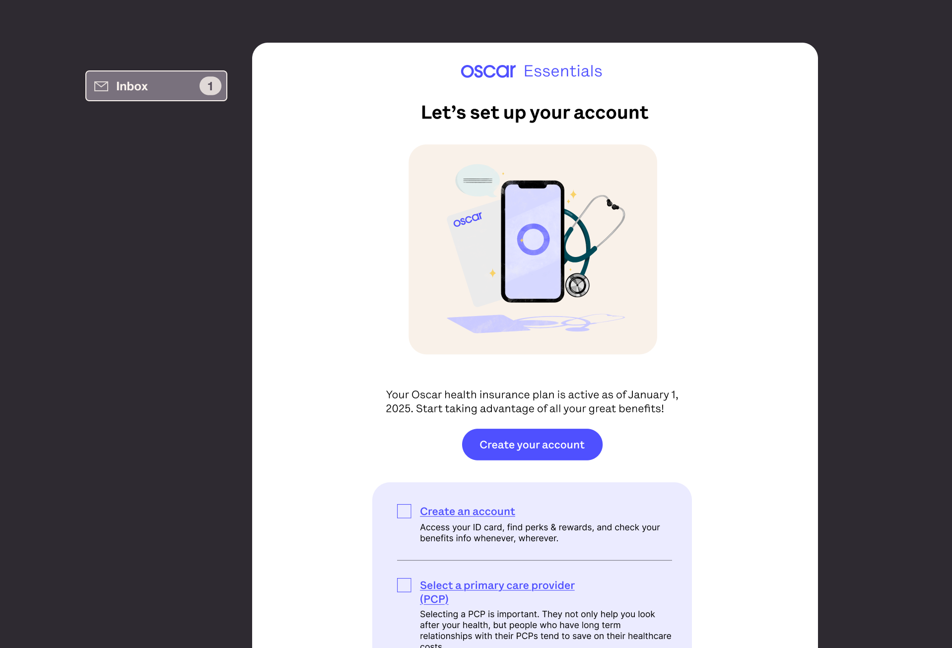
The experience begins in their inbox, where we kick things off by sending users a personalized checklist directly to their email.

Once they’ve created their account, members breeze through the new flow – one captive page, including the most important facts about their plan and a way to complete a couple of tasks, so members make progress on their checklist right away.
Fitt's Law: The time to acquire a target is directly related to the distance to the target and inversely related to the size of the target.

To make the process feel more engaging, we turned each task completion into a small win. Gamifying the experience made it feel less like a chore and more like a fun challenge.
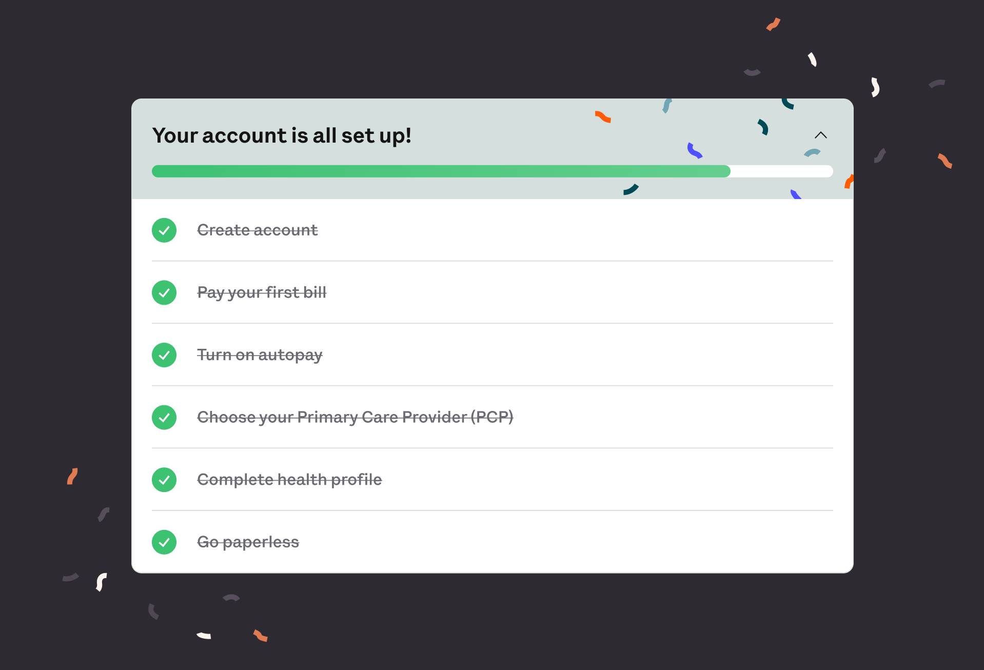
When users completed their checklist, they were greeted with a celebratory confetti screen—just to add a moment of delight after all the work they’ve done.
Experimentation before launch
Before launching the new experience to our entire population, we monitored how our new onboarding flow would perform by A/B testing it with a 50/50 bucket split.
Flow completion rates jumped from 35% to over 70% in our test bucket.
Iteration #1
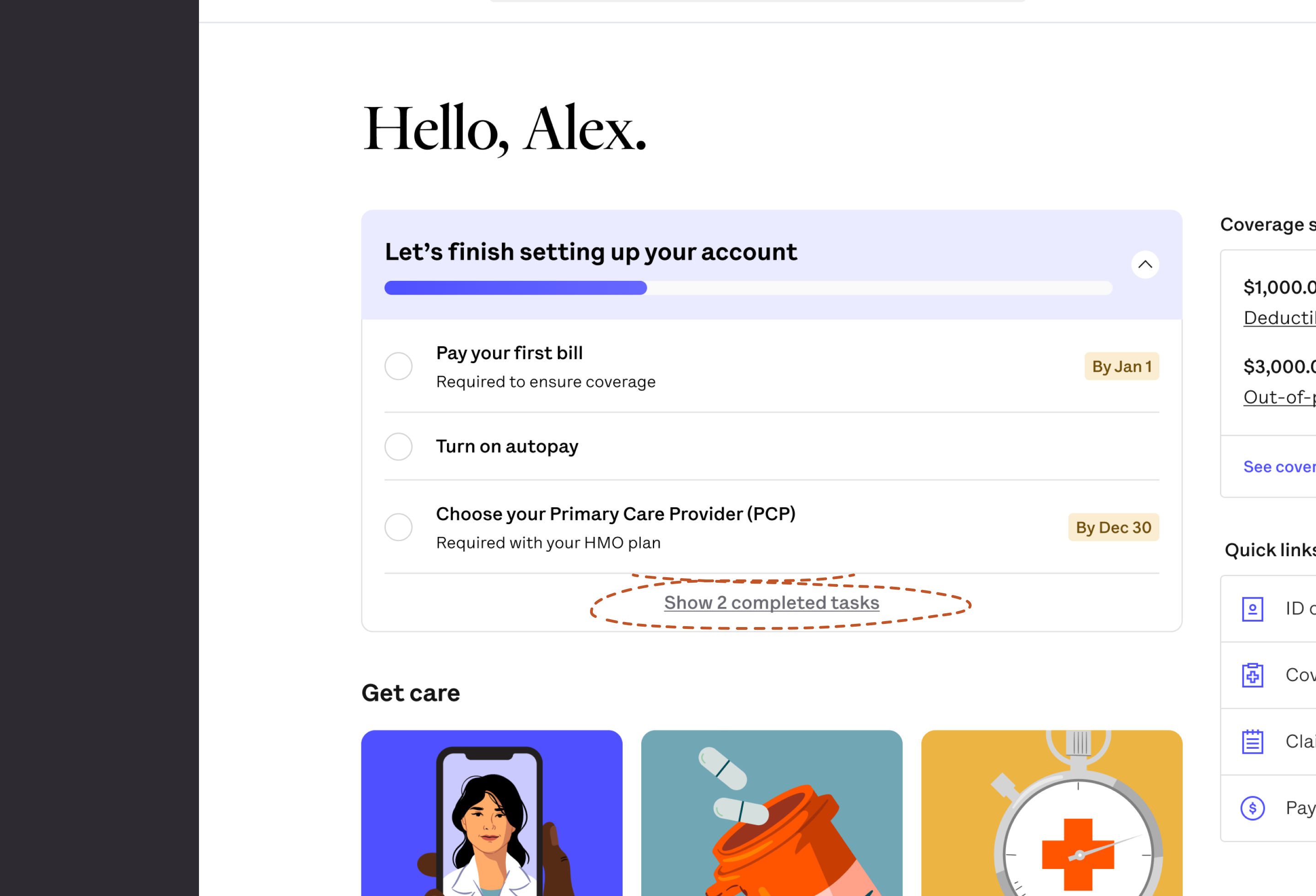
However, members were engaging less with a module directly under the onboarding checklist, one that promoted easy access to our telehealth offerings.
Our hypothesis here was that our checklist was taking up too much vertical space, pushing other important content down the page. We reduced the size of the checklist to improve the layout and create a better balance.

Iteration #2
We also noticed lower than expected bill pay rates. While this made sense because this feature was pushed less aggressively in our new designs, it was not intended. To mediate this, we added the feature to the first captive page of onboarding, making it more visible and easier for users to complete.
Next steps
While we’re thrilled with the improvement, we know there’s still more work to be done. Moving forward, we’ll focus on: personalizing the checklist even further and optimizing the mobile experience.
Our goal is to keep making the onboarding process smoother, more engaging, and ultimately more aligned with our members' needs so they can focus on what matters most: their health.